
Designing responsive eLearning is not simply about making content look good on smaller screens. It requires a fundamental shift in how courses are structured, how interactions are designed, and how learning experiences are delivered across devices.
Many organizations approach responsive eLearning as a technical conversion exercise, assuming that existing courses can be adapted with minimal changes. In reality, responsive learning demands intentional design decisions from the very beginning. Without this shift, courses may function across devices but fail to deliver a usable or engaging experience.
Download Now: The 4Rs of Rapid eLearning
In this article, you will learn how responsive eLearning courses are designed, structured, and developed, along with the principles, workflows, and decisions that enable organizations to build scalable learning experiences.
Why Responsive eLearning Design Requires a Different Approach
Traditional eLearning design is often built around fixed layouts, predefined screen sizes, and linear navigation patterns. These assumptions break down when content needs to function across devices with varying screen dimensions and interaction modes.
Responsive design requires a move away from static thinking toward flexible systems. Instead of designing screens, designers must think in terms of content blocks, fluid layouts, and adaptive interactions. This shift ensures that learning experiences remain consistent while still accommodating the constraints of each device.
The key difference lies in intent. Traditional design focuses on presentation, while responsive design focuses on usability across contexts.
The Foundation: Structuring Content for Responsive Delivery
The success of responsive eLearning begins with how content is structured. Poorly structured content cannot be fixed through design alone.
Designing Modular Content That Adapts Seamlessly
Responsive courses rely on modular content that can be rearranged and resized without losing meaning. This involves breaking down content into:
- focused learning units
- clearly defined sections
- independent content blocks
This modularity allows content to flow naturally across different screen sizes.
Establishing Clear Content Hierarchy and Prioritization
On smaller screens, space is limited, which makes prioritization essential. Designers must identify:
- what learners need to know immediately
- what can be layered progressively
- what can be removed or simplified
This ensures that the most critical information remains accessible without overwhelming the learner.
Maintaining Logical Flow Across Layout Variations
Content must follow a logical progression that remains intact regardless of layout changes. This requires:
- clear sequencing
- meaningful transitions
- consistent hierarchy
A well-structured flow ensures that learners can navigate easily, even when the layout shifts across devices.
Designing for Multiple Devices Without Compromise
Responsive eLearning design is not about optimizing for a single device. It is about ensuring usability across all devices.
Moving from Fixed Layouts to Fluid Design Systems
Designers must move away from pixel-perfect layouts and adopt fluid structures that adapt dynamically. This includes:
- flexible grids
- scalable elements
- proportional spacing
These elements allow content to reorganize itself without breaking the design.
Designing Interactions That Work Across Input Methods
Interactions must be designed to accommodate both touch-based and mouse-based inputs, as learners may switch between devices during a course. Designing for responsiveness requires:
- larger tap targets
- simplified interaction patterns
- intuitive gestures
Interactions that work well on desktops may not translate effectively to mobile, making this consideration essential.
Ensuring Readability and Visual Clarity
Text readability is often overlooked but plays a critical role in responsive design. Designers must ensure that:
- font sizes scale appropriately
- line spacing supports readability
- content remains legible without zooming
This ensures that learners can engage with content comfortably across devices.
Instructional Design Considerations in Responsive eLearning
Responsive design has significant implications for instructional design, as it influences how content is delivered and how learners interact with it.
Designing for Shorter, Context-Driven Learning Moments
Mobile learning often occurs in brief, focused sessions rather than extended periods of uninterrupted attention. This requires content to be concise, clearly structured, and aligned with specific learning objectives.
By designing for shorter learning moments, organizations can improve engagement and retention while making learning more accessible.
Integrating Real-World Scenarios and Applications
Responsive eLearning is particularly effective when it incorporates scenarios and contextual learning experiences that reflect real-world situations. This approach allows learners to apply knowledge directly, making the learning experience more relevant and impactful.
Layering Content to Manage Cognitive Load
Presenting all information at once can overwhelm learners, especially on smaller screens. Responsive courses benefit from layered content structures that reveal information progressively, allowing learners to explore content at their own pace.
This approach enhances comprehension and reduces cognitive overload.
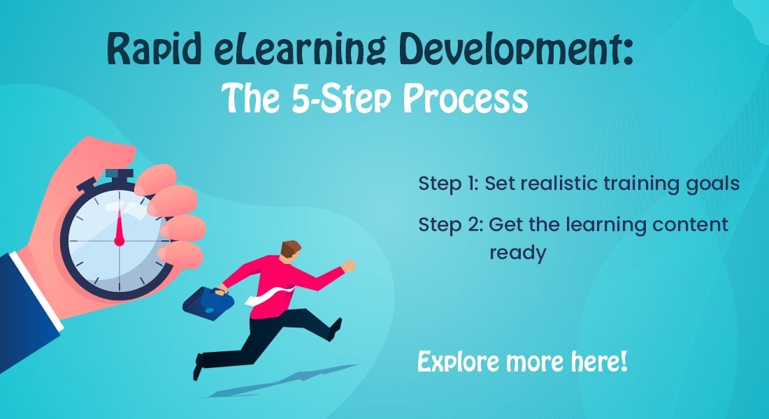
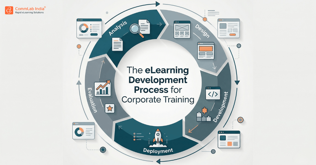
Development Workflow for Responsive eLearning
Design and development must work together to create effective responsive courses.
Step 1: Define the Design System
Before development begins, organizations should establish:
- layout guidelines
- interaction patterns
- visual standards
This ensures consistency across courses.
Step 2: Select the Right Development Approach
Responsive eLearning development can be achieved through modern authoring tools that support fluid layouts and device previews. The focus should be on:
- ease of content updates
- scalability
- compatibility across devices
Step 3: Build Using Flexible Components
Courses should be built using reusable components such as:
- content blocks
- interaction templates
- media modules
This reduces development time and improves consistency.

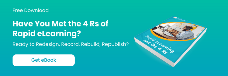
Have You Met the 4 Rs of Rapid eLearning?
Accelerate Learning and Maximize its Impact With the 4 Rs of Rapid eLearning!
4Rs of rapid eLearning:
- Redesign
- Record
- Rebuild
- Republish
Step 4: Optimize Media and Performance
Responsive courses must perform well across varying network conditions. This involves:
- compressing media assets
- reducing load times
- avoiding heavy animations
Performance directly impacts learner engagement.
Step 5: Test Across Devices and Scenarios
Testing should go beyond checking functionality. It should evaluate:
- usability on different devices
- navigation consistency
- interaction effectiveness
This ensures that the learning experience remains intact across contexts.
Common Development Challenges and How to Overcome Them
Challenge 1: Converting Legacy Content
Legacy courses often rely on fixed layouts and complex interactions that do not translate well into responsive formats.
Solution: Redesign content with responsiveness in mind rather than attempting direct conversion.
Challenge 2: Maintaining Consistency Across Devices
Ensuring a consistent experience across devices can be difficult when layouts change dynamically.
Solution: Focus on consistent content structure and interaction patterns rather than identical layouts.
Challenge 3: Tool Limitations
Not all authoring tools support true responsiveness, which can lead to compromises in design.
Solution: Choose tools that enable fluid layouts and provide flexibility in design.
Challenge 4: Balancing Design and Performance
Highly interactive designs can impact performance, especially on mobile devices.
Solution: Prioritize usability and performance over visual complexity.
Responsive eLearning in High-Impact Use Cases
Responsive eLearning delivers significant value in scenarios where accessibility and flexibility are critical.
Field Force Training
Responsive eLearning plays a critical role in field environments where learners rely on mobile devices. Training must be:
- quick to access
- easy to navigate
- relevant to immediate tasks
This enables real-time learning and improves performance.
Corporate Training Programs
For organizations delivering large-scale corporate training, responsiveness ensures:
- accessibility across devices
- consistency in delivery
- scalability
This reduces the need for multiple course versions.
Continuous Learning and Upskilling
Responsive eLearning supports ongoing learning by enabling employees to access training whenever needed. This aligns learning with real-world workflows.
From Course Design to Experience Engineering
Responsive eLearning represents a shift from designing individual courses to engineering holistic learning experiences that adapt to different contexts. This shift requires integrating design, development, and instructional strategy into a cohesive system that prioritizes usability and scalability.
Organizations that embrace this approach move beyond simply making courses accessible on multiple devices. They create learning ecosystems that are flexible, consistent, and aligned with how employees work and learn.
Conclusion
Responsive eLearning design and development are not isolated activities. They are part of a larger strategy to create scalable, flexible, and effective learning experiences.
By structuring content thoughtfully, designing with flexibility in mind, and adopting development practices that support responsiveness, organizations can build training programs that remain relevant across devices and contexts.
The goal is not simply to make courses accessible on multiple devices. It is to ensure that learning remains usable, meaningful, and effective wherever it is accessed.