Many Articulate Storyline courses are built to function well, but not necessarily to feel intuitive. They launch properly, track completion accurately, and deliver content as intended. Yet from the learner’s point of view, the experience can still feel generic, crowded, or harder to navigate than it should be. Menus may compete with content, buttons may not clearly signal what is clickable, and the overall interface may do little to guide learners smoothly from one part of the course to the next.
This is why Storyline customization deserves far more strategic attention than it usually receives.
In modern corporate eLearning, the learner interface is not a decorative outer layer. It is a functional part of the learning experience itself. It shapes how quickly learners understand where they are, what they are expected to do, how much they have completed, and whether the course feels easy enough to continue. A course that is visually cleaner, navigationally clearer, and interactionally consistent does more than look polished. It removes friction from the learning process.
Articulate Storyline gives learning teams enough flexibility to move beyond the default player and create interfaces that are more purposeful, more branded, and more learner-friendly. But customization becomes truly valuable only when it is driven by usability and learning intent rather than visual novelty.
A stronger learner interface helps people focus on the training itself instead of spending unnecessary effort figuring out the screen. That is the real opportunity. Storyline customization, when done well, can improve orientation, interaction confidence, completion visibility, mobile usability, and overall learner experience in ways that directly support training outcomes.
This article explores how to customize Articulate Storyline with that broader goal in mind. Rather than treating customization as a collection of isolated tips, it looks at how GUI design, player setup, menus, buttons, navigation, and branding come together to shape the quality of the learner experience.
Download eBook Now: Rapid eLearning Authoring Tools
Table of Contents
- The Real Role of Storyline Customization in Modern eLearning
- Moving from Default Setup to Intentional Learner Experience
- Designing a Storyline GUI That Feels Clear and Intuitive
- Customizing the Player Without Creating Visual Clutter
- Menus, Progress Indicators, and Learner Orientation
- Buttons, States, and Interaction Cues That Build Confidence
- Designing Storyline Interfaces for Tablets and Touch-Based Learning
- Using Branding to Strengthen the Experience, Not Distract from It
- Common Customization Mistakes That Weaken Learner Experience
- FAQs
- Conclusion
The Real Role of Storyline Customization in Modern eLearning
Articulate Storyline is widely valued because it helps teams develop eLearning efficiently. That efficiency matters, especially for organizations that need to create training at scale across onboarding, compliance, product learning, systems training, and performance support. Yet speed often creates its own limitation. Teams move quickly from content to publishing and assume the default interface is good enough because the course technically works.
From the learner’s perspective, however, technical functionality is only part of the experience.
Learners do not interact with a course as a collection of slides. They experience it as a guided environment. They notice whether the interface feels structured or cluttered, whether clickable elements are obvious, whether navigation is easy to follow, and whether the overall layout helps them focus or causes hesitation. These details are not cosmetic. They influence how comfortably learners move through the course and how much mental energy they spend on navigation rather than learning.
That is why customization should be treated as a learner experience decision, not simply a design decision.
A well-customized Storyline course can help learners do several things more easily:
- Orient themselves quickly
Learners should immediately understand where they are and what section they are in. - Act with confidence
The interface should make the next step obvious without requiring trial and error. - Track their progress
Visible progress reduces uncertainty and makes long courses feel more manageable. - Stay focused on content
A cleaner interface prevents avoidable distraction and supports concentration.
When these conditions are in place, the course begins to feel more supportive and more professional. When they are missing, even strong content can feel harder to access than it should.
In the context of Storyline, customization is best understood as the process of shaping the learner-facing interface so the course is easier to navigate, easier to understand, and more aligned with both the learning objective and the learner’s environment.
Moving from Default Setup to Intentional Learner Experience
The gap between an average Storyline course and a strong one often comes down to intentionality.
Many courses rely on Storyline’s built-in player and default navigation settings because they are readily available and easy to implement. There is nothing inherently wrong with that. In fact, default structures can be useful when they support the learning context. The problem begins when those defaults are used without asking whether they genuinely help the learner.
An intentional learner experience starts with a more important question: What does the learner actually need from the interface in order to move through this course with clarity and confidence?
That question changes the design process. Instead of leaving menus, controls, and screen elements in place by habit, teams begin making more purposeful choices about what should remain visible, what should be simplified, and what should be redesigned.
For example, a short compliance refresher may benefit from simple next and previous controls with a clear completion path. A software systems module may require a stronger structural menu so learners can revisit steps. A scenario-based course may need a more immersive screen treatment with fewer persistent distractions. In each case, the interface should reflect the nature of the learning task.
Default is not the problem. Unexamined default is.
That distinction is worth emphasizing. Storyline’s built-in structures are not weak by definition. They become weak when they remain unchanged even though the course demands something different.
A more deliberate interface usually emerges from selective refinement rather than full redesign. Teams often get better results not by reinventing everything, but by making a few smart decisions about focus, clarity, and consistency.
A useful planning lens
Before customizing a Storyline course, it helps to ask:
| Question | Why it matters |
| What does the learner need to see at all times? | This helps determine what should remain visible in the player or on-screen layout. |
| Is the course linear, exploratory, or mixed? | Navigation and menu structure should reflect how freely learners are meant to move. |
| Will learners return to the course over time? | Persistent orientation and progress cues become more important when learning is interrupted. |
| Which devices are most likely to be used? | Layout, menu sizing, and clickability should align with the learner’s real environment. |
| How strong should branding be? | Branding should support trust and recognition without overwhelming usability. |
These questions move customization from tactical tweaking to more strategic design thinking.
Designing a Storyline GUI That Feels Clear and Intuitive
A well-designed graphical user interface should feel natural enough that learners barely notice it. Not because it lacks design, but because it helps them move forward without confusion. They know where to look, what matters most on the screen, and what they are expected to do next.
That kind of experience comes from interface clarity, not visual excess.
One of the most common problems in Storyline courses is that too many screen elements compete for attention at once. Titles, body text, icons, menus, buttons, tabs, and decorative shapes all sit at similar visual weight. As a result, learners are forced to work harder than necessary just to interpret the screen.
A stronger GUI creates visual hierarchy. It tells the eye what to notice first, what to treat as supporting information, and where navigation fits within the larger screen structure.
A useful way to think about interface hierarchy
Most Storyline screens work better when they separate information into four clear layers:
- Primary learning focus
This is the main concept, interaction, or action the learner should pay attention to first. - Supporting information
This includes instructions, context, labels, or explanatory text that helps clarify the task. - Navigation layer
Buttons, progress indicators, and menu access should be visible but not dominant. - Branding layer
Colors, icons, and identity cues should reinforce the experience without overwhelming it.
When these layers are clearly prioritized, the screen becomes easier to scan and easier to trust.
A quick usability test
A learner looking at a Storyline screen for the first time should be able to answer three questions within a few seconds:
- What is this screen about?
- What am I supposed to do here?
- How do I move forward?
If the answer to any of these remains unclear, the interface is probably trying to do too much at once.
Customizing the Player Without Creating Visual Clutter
The Storyline player is often the first area teams customize, and for good reason. It controls much of the persistent interface around the course, including menus, title space, side panels, and navigation controls. But player customization is most effective when it is guided by restraint.
In many cases, improving the player means removing unnecessary elements rather than adding new ones.
A course interface should give learners access to what they need, while protecting them from what they do not. When controls, tabs, labels, and structural elements remain visible simply because they are available, they can consume space and attention that should belong to the content itself.
Good player customization usually does three things well
- Preserves essential orientation
Learners should still know where they are and how to continue. - Protects screen space for learning content
The content area should not feel compressed by unnecessary player chrome. - Supports focus
The player should help structure the experience without becoming a distraction.
A simple design principle
If an on-screen element does not help learners orient themselves, navigate, or complete the course, it should be questioned.
This principle is especially useful for courses that include visual media, simulations, layered interactions, or scenario-based screens where every bit of space matters. A cleaner player can make the experience feel calmer and more modern while also improving usability.
When to simplify the player
Player simplification is often especially valuable when:
- the course is short and linear
- the visual layout carries most of the navigation logic
- the content is interaction-heavy
- learners are using tablets or smaller screens
- the screen already contains enough guidance within the slide itself
In such cases, the best player is one that supports the experience quietly and consistently rather than competing with it.
Menus, Progress Indicators, and Learner Orientation
One of the most overlooked aspects of learner experience is orientation. Learners want to know where they are, how far they have progressed, and whether they can easily return to unfinished sections later. These questions may seem small, but they strongly influence how manageable and motivating a course feels.
That is why menus are more than navigation tools. They are orientation tools.
A thoughtful menu gives the learner a sense of structure. It makes the course feel organized rather than endless. It reduces the mental effort required to understand what has been completed and what remains.
This becomes especially important in corporate learning environments, where training is often completed in short intervals between work responsibilities. Learners may step away and return later. If they cannot quickly reorient themselves, momentum is lost.
What an effective menu should do
A strong menu should:
- make the course structure easy to understand
- use clear and meaningful labels
- help learners resume where they left off
- show section-level or topic-level progress where useful
- avoid overwhelming the learner with too much information at once
Why progress visibility matters
Visible progress is not just a convenience feature. It can improve motivation by making advancement feel tangible. When learners can see what they have completed and what remains, they experience greater control and less ambiguity.
This is particularly useful in:
- onboarding journeys
- long compliance modules
- certification pathways
- technical training curricula
- multi-part learning programs
Signs that menu design needs improvement
Menu design may be weakening the learner experience when:
- labels are vague or repetitive
- too many items appear at once
- the menu occupies excessive screen space
- completion status is unclear
- the structure of the course is visible only after trial and error
A better menu does not necessarily mean a larger menu or a more complex one. It simply means one that helps learners build a clear mental map of the experience.
| Menu design choice | Learner impact |
| Clear section labels | Improves orientation and confidence |
| Visible completion status | Encourages continuation and self-management |
| Simple structure | Reduces cognitive load |
| Overcrowded menu | Creates friction and visual distraction |
| Poorly labeled sections | Makes navigation feel uncertain |
A useful menu should help learners progress with confidence, not simply display a list of slides.
Buttons, States, and Interaction Cues That Build Confidence
Buttons may appear to be minor elements within a course, but they carry a great deal of responsibility. They are the places where learners act. Every time someone decides whether to click, explore, select, continue, or revisit something, the quality of the interface is being tested.
When buttons are consistent and interaction cues are clear, the course feels intuitive. When they are inconsistent or subtle to the point of ambiguity, learners hesitate.
That hesitation matters. Even brief uncertainty adds friction to the experience.
What learners need from interactive elements
At a minimum, clickable elements should answer three questions clearly:
- Can I interact with this?
- What will happen if I do?
- Did the system register my action?
If the interface fails to answer these clearly, learners are forced to experiment, and that weakens confidence.
Why object states are so valuable
Storyline’s states are one of the most useful tools for creating a responsive learner experience. They show whether something is active, selected, visited, completed, disabled, or awaiting action. This kind of feedback helps the course feel more communicative.
Object states are especially helpful in:
- tabs and click-to-reveal interactions
- process explorations
- branching screens
- simulations
- self-paced review activities
Without visual state changes, learners can lose track of what they have already explored. With them, the course feels more intelligible and more respectful of the learner’s time.
Good button design depends on consistency
To make interaction patterns feel natural, keep these elements stable throughout the course:
- shape and visual style
- placement
- labeling approach
- hover or selected behavior
- visited and completed states
- distinction between active and inactive options
That consistency reduces relearning. The learner understands the interaction pattern once and carries that understanding through the course.
A strong rule of thumb is simple: if an interaction matters, it should look unmistakably interactive.
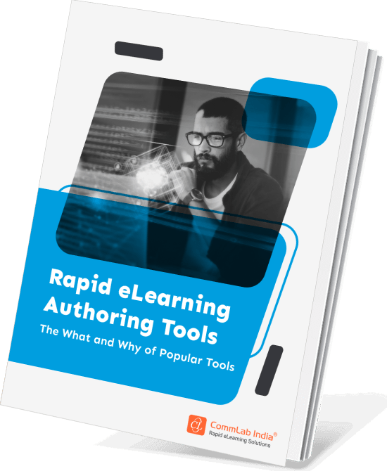
Rapid eLearning Authoring Tools
Explore the What and the Why of Popular Rapid eLearning Development Tools, and GenAI Tools
- Categories of eLearning Authoring Tools
- Considerations to Choose Your Next Authoring Tool
- Features of Popular Rapid Authoring Tools
- GenAI Tools to Create Content, Graphics, Audio, and Video
Designing Storyline Interfaces for Tablets and Touch-Based Learning
A Storyline interface that works well on a desktop may become awkward or frustrating on a tablet. Menu areas can feel cramped, titles may become harder to read, and click targets that seemed acceptable in development can become difficult to tap accurately.
This is why touch usability deserves far more attention than it often gets.
In many organizations, learners access training through iPads, shared devices, field tablets, hybrid work environments, and screen sizes that vary throughout the day. Even when a course is not designed as fully mobile-first, it still needs to respect these conditions.
Touch-friendly design is now part of mainstream usability
Several interface decisions become more important in touch-based contexts:
- Larger tap targets
Buttons and interactive objects should be large enough to select comfortably. - Readable menu text
If learners need to zoom or strain to read menu items, navigation becomes slower and more frustrating. - Adequate spacing
Tight layouts increase accidental taps and reduce visual comfort. - Visible navigation cues
Tablet users benefit from especially clear prompts and directional consistency. - Balanced title treatment
Headings should remain readable without occupying disproportionate screen space.
A practical design test
If an interaction feels precise or delicate on a desktop, it is unlikely to feel comfortable on a tablet. This is often the clearest signal that the interface needs adjustment.
The goal is not simply to make the course fit on another screen. The goal is to preserve ease of use across the devices learners are actually using.
Using Branding to Strengthen the Experience, Not Distract from It
Branding is one of the most common reasons teams choose to customize Storyline. They want courses to feel aligned with the organization’s identity rather than like default templates. That instinct is understandable and often valuable. A well-branded course can communicate professionalism, increase familiarity, and help training feel more integrated with the organization’s broader digital environment.
But branding should never overpower usability.
When branding is applied without restraint, it can reduce readability, crowd the interface, and shift attention away from the learning task. Oversized logos, heavy color fields, decorative shapes, or overly assertive visual treatments may create stronger brand presence, but they can also introduce unnecessary noise.
Better branding decisions tend to be subtle and structural
The most effective branded Storyline interfaces usually rely on:
- consistent color logic for navigation and emphasis
- typography that supports readability and recognition
- interface components that align with the visual identity
- icons and layout patterns that feel coherent across screens
- a calm visual environment that reflects the brand without dominating the course
This creates a more mature result. The learner feels the course is well-designed and aligned with the organization, but their attention remains where it belongs, on the content and the actions required.
Branding works best when it supports trust
In eLearning, branding should strengthen credibility and continuity. It should help the course feel intentional, polished, and aligned with the learner’s wider workplace environment. When applied thoughtfully, it does exactly that. When overdone, it competes with the learning experience it was supposed to elevate.
Common Customization Mistakes That Weaken Learner Experience
Customization becomes counterproductive when teams focus on uniqueness more than usability. In fact, some of the most frustrating Storyline courses are heavily customized, not because customization itself is a problem, but because it was applied without sufficient attention to how learners actually use the course.
A few mistakes show up repeatedly.
Common mistakes to avoid
- Over-designing the interface
Too many visual treatments, layered effects, or decorative components can make screens harder to scan. - Hiding navigation too aggressively
Minimalism can look elegant, but not when learners cannot quickly figure out how to continue. - Using inconsistent interaction patterns
If screens behave differently without reason, learners must keep relearning the interface. - Prioritizing aesthetics over purpose
Customization should support the instructional task, not distract from it. - Ignoring the learner’s real device context
A design reviewed only on a desktop may fail in the environments where training is actually completed. - Making the interface feel smarter than the learner
Hidden logic, subtle hotspots, or unexplained conventions often create avoidable confusion.
These issues are not always dramatic, but they accumulate. Small usability breakdowns add up to a weaker overall experience.
A helpful review question
Before finalizing a customized Storyline course, ask: Does this design reduce effort for the learner, or does it simply look more designed to the development team?
That question often reveals whether the interface is genuinely improving the experience.
FAQ
1. How do you customize Articulate Storyline for better learner experience?
A. The best way to customize Articulate Storyline is to begin with usability. Simplify the player, clarify navigation, make progress visible, use consistent buttons and states, and ensure that every interface choice helps learners move through the course with less friction and more confidence.
2. What is the difference between Storyline customization and GUI design?
A. Storyline customization usually refers to changes made to the player, menus, buttons, and other interface elements. GUI design is broader. It shapes the complete learner-facing experience so the course feels coherent, intuitive, and easier to navigate from beginning to end.
3. Should I use the default Storyline player or customize it?
A. The default player can work well when it aligns with the course context. However, customization is often useful when you need to reduce clutter, create more space for content, improve navigation clarity, or align the interface more closely with the learning task and audience needs.
4. Why are buttons and object states important in Storyline?
A. Buttons and object states help learners understand what is clickable, what has already been explored, and what action is expected next. This improves confidence, reduces hesitation, and makes the course feel more responsive and easier to use.
5. How can I make Storyline courses more tablet-friendly?
A. To make Storyline courses more tablet-friendly, use larger tap targets, clearer menu text, more generous spacing, readable titles, and layouts that remain easy to use on smaller screens. Touch-based usability should be tested intentionally rather than assumed.
6. How much branding should be added to a Storyline course?
A. Branding should be visible enough to create recognition and trust, but not so strong that it interferes with readability or navigation. The best branded Storyline courses use color, typography, and interface consistency thoughtfully rather than relying on visual overload.
7. What is the biggest mistake teams make when customizing Storyline?
A. The biggest mistake is customizing primarily for appearance. When visual uniqueness takes priority over learner clarity, the interface becomes harder to use. Effective customization should always reduce friction and support navigation, orientation, and instructional purpose.
Conclusion
Articulate Storyline gives learning teams far more than a fast way to build courses. It gives them the ability to shape how those courses are actually experienced by learners. That distinction matters because learners do not engage with content in isolation. They engage with content through an interface, and the quality of that interface influences whether the experience feels clear, supportive, polished, and worth continuing.
This is why Storyline customization deserves a more strategic role in modern eLearning development.
When menus are clearer, players are simplified, buttons are more intuitive, progress is easier to understand, and layouts are designed with real learner contexts in mind, the learning experience improves in ways that are immediate and meaningful. The course becomes easier to enter, easier to navigate, and easier to complete.
At an organizational level, the value is even greater. Teams that build reusable UX patterns and apply them consistently across Storyline courses do more than improve isolated modules. They create a stronger, more coherent learning ecosystem.
The most effective Storyline courses are not always the most elaborate. More often, they are the ones that make good design decisions quietly and consistently, so learners can focus on learning instead of figuring out the interface.