
Most organizations do not struggle with creating training content. They struggle with delivering it in a way that aligns with how employees actually work and learn.
A salesperson preparing for a client meeting, a technician resolving an issue on-site, or a manager completing compliance training while traveling are not thinking about learning formats. They expect training to be available instantly, accessible on any device, and usable without friction. When training fails to meet these expectations, it does not matter how well the content is designed because it will not be used effectively.
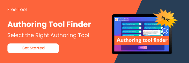
Access Tool: eLearning Authoring Tool Finder
Responsive eLearning has emerged as a response to this reality. It is not simply a design trend or a technical enhancement. It represents a strategic shift toward making learning accessible, flexible, and aligned with real-world workflows.
In this article, you will learn how responsive eLearning works, why it has become central to modern training strategies, and how organizations can adopt it effectively without fragmenting their learning ecosystem.
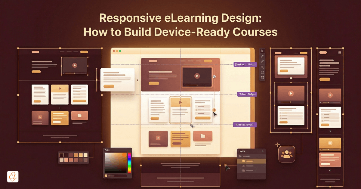
What is Responsive eLearning?
Responsive eLearning is not simply about shrinking content to fit smaller screens. It is about designing learning experiences that automatically adapt to different devices, screen sizes, and orientations while maintaining usability and instructional effectiveness.
At its core, responsive learning design ensures that:
- content reorganizes dynamically across devices
- navigation remains intuitive whether accessed on mobile, tablet, or desktop
- media and interactions adjust without breaking the learning flow
- the learning experience remains consistent without requiring multiple versions
This distinction is critical. Traditional approaches often required separate courses for desktop and mobile. Responsive eLearning eliminates that duplication by creating a single course that adapts intelligently.
Why Responsive eLearning Has Become a Strategic Priority
The rise of responsive learning is not driven by technology trends alone. It is driven by changes in workforce behavior, business expectations, and learning consumption patterns.
Learning Has Moved Beyond the Desktop
Employees no longer learn in controlled environments. Training happens:
- during work, not outside it
- across locations, not just offices
- on demand, not on schedule
If learning is restricted to a desktop experience, it becomes inaccessible in the moments when it is most needed.
The Workforce Is Increasingly Distributed
Global teams, field workers, and remote employees require training that works across environments. Responsive eLearning ensures:
- consistent access across geographies
- standardized learning experiences
- reduced dependency on physical infrastructure
Speed of Change Demands Flexible Delivery
Product updates, compliance changes, and process shifts require training to be deployed quickly. Responsive formats allow organizations to:
- update a single course instead of multiple versions
- deploy faster across all devices
- maintain consistency in messaging
Learner Expectations Have Changed
Modern learners expect experiences similar to consumer apps. They expect:
- intuitive navigation
- seamless transitions between devices
- immediate access without technical friction
Responsive eLearning aligns training delivery with these expectations.
Responsive vs Adaptive Learning Design
One of the most misunderstood aspects of modern eLearning is the difference between responsive and adaptive design.
Responsive Design
Responsive design focuses on layout and usability. The same content adjusts automatically across devices without changing the learning path.
Characteristics include:
- fluid layouts
- scalable media
- consistent learning flow
This approach emphasizes scalability and consistency, making it ideal for organizations that need to deliver uniform training across a wide audience.
Adaptive Design
Adaptive design goes a step further by altering the learning experience based on predefined conditions such as device type or learner behavior.
This may involve:
- different layouts for mobile and desktop
- modified content for specific contexts
- tailored interactions
This allows for more tailored experiences but increases complexity in development and maintenance.
Strategic Implication
For most enterprise use cases, responsive design provides the right balance between efficiency and effectiveness. It enables organizations to scale training without creating unnecessary complexity, while still delivering a high-quality learning experience.
Adaptive design can be valuable in specialized scenarios where context-specific customization is critical, but it is not required for most training programs.
Responsive eLearning vs HTML5: Understanding the Difference
Responsive eLearning and HTML5 are often used interchangeably, but they serve different purposes.
HTML5
HTML5 is a technology standard that enables content to run across modern browsers and devices without plugins.
It ensures:
- cross-platform compatibility
- mobile accessibility
- multimedia support
Responsive eLearning
Responsive eLearning is a design approach that determines how content behaves across devices.
Why This Distinction Matters
HTML5 enables access. Responsive design ensures usability.
An HTML5 course without responsive design may still function on mobile devices, but the experience may be difficult to navigate or visually inconsistent.
For enterprise training, both are necessary. HTML5 provides the foundation, while responsive design delivers the experience.
Key Components of a Responsive Learning Strategy
Implementing responsive eLearning requires more than choosing the right tools. It requires a structured approach to designing and delivering learning experiences.
1. Content Designed for Flexibility
Content must be structured in a way that allows it to adapt across devices.
This includes:
- modular learning units
- concise and focused messaging
- clear visual hierarchy
Content that is overly dense or dependent on fixed layouts will not translate effectively into responsive formats.
2. Device-Agnostic Experience Design
Design decisions should not prioritize one device over another. Instead, they should ensure usability across all devices.
This involves:
- touch-friendly interactions
- simplified navigation structures
- readable text across screen sizes
3. Performance Optimization
Responsive courses must load quickly and function smoothly across varying network conditions.
Organizations should:
- optimize media assets
- minimize heavy animations
- ensure fast loading times
4. Consistent Learning Experience
While layouts may change, the learning experience should remain consistent.
Learners should be able to:
- switch devices without losing progress
- navigate intuitively across formats
- engage with content without confusion
How Organizations Adopt Responsive eLearning
Adopting responsive eLearning is not a simple transition from one format to another. It involves rethinking how training is designed, developed, and delivered.
Step 1: Evaluate Existing Training Content
Start by identifying:
- courses that are heavily used
- content that requires frequent updates
- training that needs mobile accessibility
This helps prioritize what should be converted first.
Step 2: Define a Responsive Learning Framework
Establish guidelines for:
- content structure
- design standards
- interaction patterns
This ensures consistency across all courses.
Step 3: Select the Right Authoring Tools
Modern tools enable responsive course development without requiring extensive coding.
The focus should be on:
- flexibility
- scalability
- ease of updates
Step 4: Redesign, Not Just Convert
Simply converting legacy courses is not enough. Content must be redesigned to fit responsive principles.
This includes:
- restructuring content into smaller units
- simplifying visuals
- rethinking interactions
Step 5: Test Across Devices
Before deployment, courses should be tested across:
- smartphones
- tablets
- desktops
Testing ensures consistency and usability across all environments.
Step 6: Scale with Governance
As adoption grows, organizations need governance models to maintain quality and consistency.
This involves:
- design standards
- review processes
- centralized content management
Use Cases Where Responsive eLearning Delivers Maximum Impact
Responsive eLearning is particularly effective in scenarios where accessibility and flexibility are critical.
Sales Training
Sales teams require quick access to product knowledge and updates. Responsive learning enables:
- on-the-go learning
- quick refreshers before meetings
- access across devices
Field Force Training
Technicians and field workers often operate in dynamic environments. Responsive learning supports:
- real-time troubleshooting
- just-in-time learning
- mobile-first access
Compliance Training
Compliance programs benefit from:
- wider accessibility
- consistent delivery
- easier tracking across devices
Global Workforce Training
For distributed teams, responsive eLearning ensures:
- uniform learning experiences
- accessibility across regions
- scalability
Common Challenges and How to Address Them
Despite its advantages, implementing responsive eLearning comes with challenges that organizations must address strategically.
Challenge 1: Legacy Content Limitations
Older courses are often not designed for flexibility.
Solution: Redesign content instead of directly converting it.
Challenge 2: Overloading Mobile Experiences
Trying to fit too much content into smaller screens reduces usability.
Solution: Focus on clarity and prioritization.
Challenge 3: Tool Dependency
Relying heavily on specific tools without a strategy leads to inconsistency.
Solution: Define design standards independent of tools.
Challenge 4: Lack of Strategic Alignment
Treating responsive learning as a design upgrade rather than a strategic shift limits its impact.
Solution: Integrate responsive learning into overall training strategy.
The Strategic Shift: From Courses to Learning Experiences
Responsive eLearning reflects a broader transformation in how organizations approach training. The focus shifts from creating courses for specific platforms to designing learning experiences that adapt to the learner’s context.
This shift emphasizes flexibility, accessibility, and usability. It enables learning to occur in the flow of work rather than in isolated sessions. It aligns training delivery with real-world needs, making learning more relevant and effective.
Conclusion
Responsive eLearning is no longer optional for organizations aiming to build scalable, accessible, and effective training programs.
It aligns learning delivery with how modern employees work, learn, and perform. It reduces complexity in content management while improving accessibility and engagement across devices.
The real value lies not in the technology itself, but in the shift it enables. A shift from rigid, device-bound training to flexible, learner-centric experiences that adapt to context, need, and environment.
Organizations that embrace this shift position themselves to deliver training that is not only accessible, but truly usable in the moments that matter.